Creating a gallery wall in a small space can feel intimidating. When square footage is limited, every design decision matters. One wrong move and the wall can shift from stylish to overwhelming. The good news is that a well-planned gallery wall can actually make a small room feel larger, more personal, and thoughtfully designed.
The key is intention. Small-space gallery walls are not about filling every inch of wall space. They are about balance, breathing room, and visual flow. When done right, they add depth, character, and warmth without cluttering the room.
This guide walks you through smart, realistic gallery wall ideas that work beautifully in compact homes, apartments, and tight corners, while keeping the space open and calm.
Start With a Clear Visual Goal
Before hanging a single frame, decide what you want the wall to do for the space.
Ask yourself:
- Should it feel calm or energetic?
- Do you want it to blend into the room or stand out as a feature?
- Is the goal to display art, photos, or a mix of both?
In small spaces, restraint matters. A gallery wall with a clear theme or mood feels intentional rather than chaotic. This foundation guides every choice you make next, from frame color to spacing.
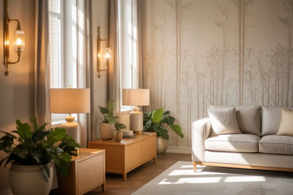
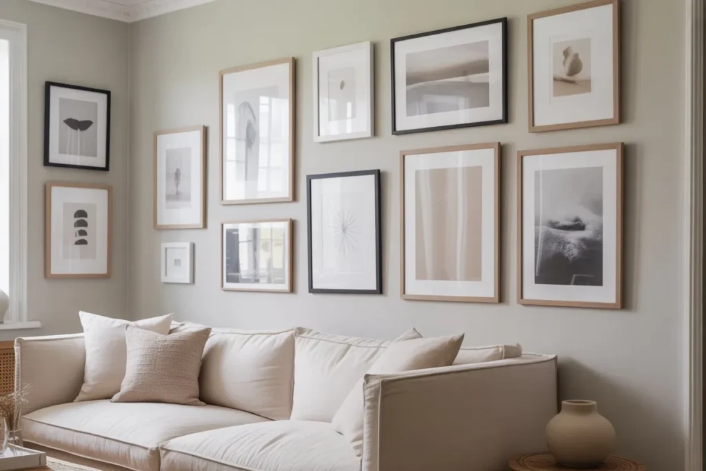
Choose the Right Wall for Maximum Impact
Not every wall is suitable for a gallery wall, especially in compact rooms.
Best spots for small-space gallery walls
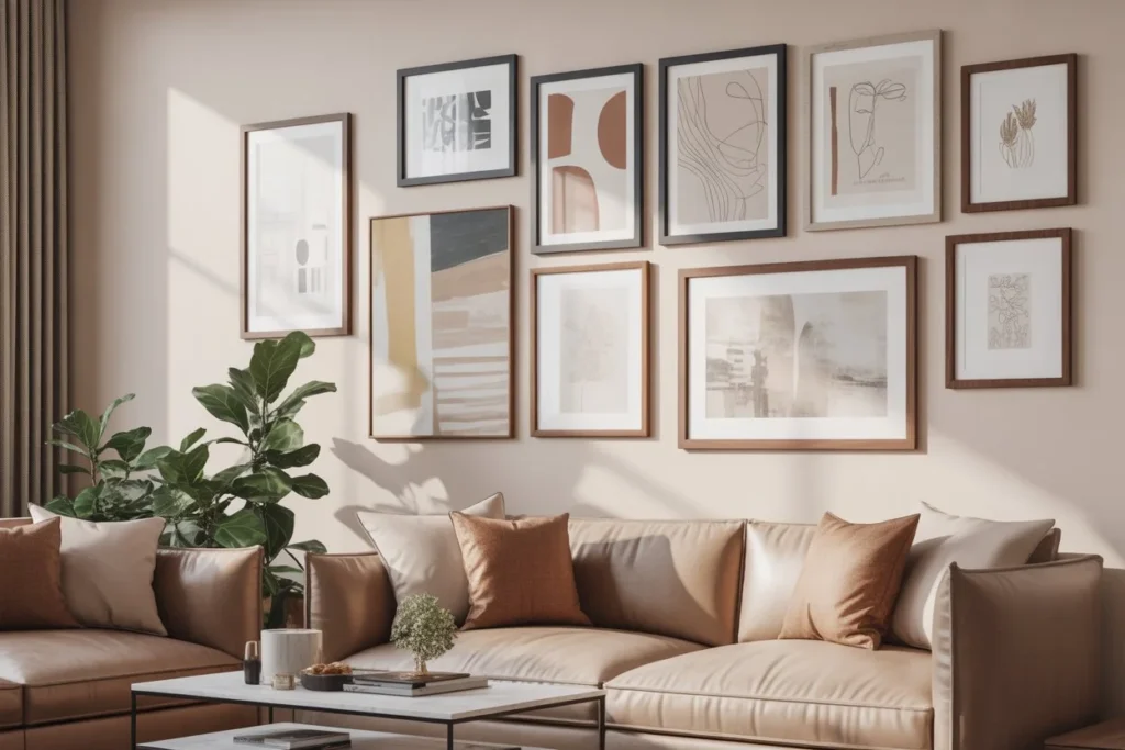
- Above a sofa or daybed
- Over a console table or bench
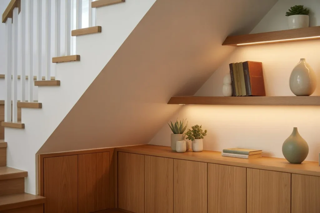
- Along a hallway or stairwell
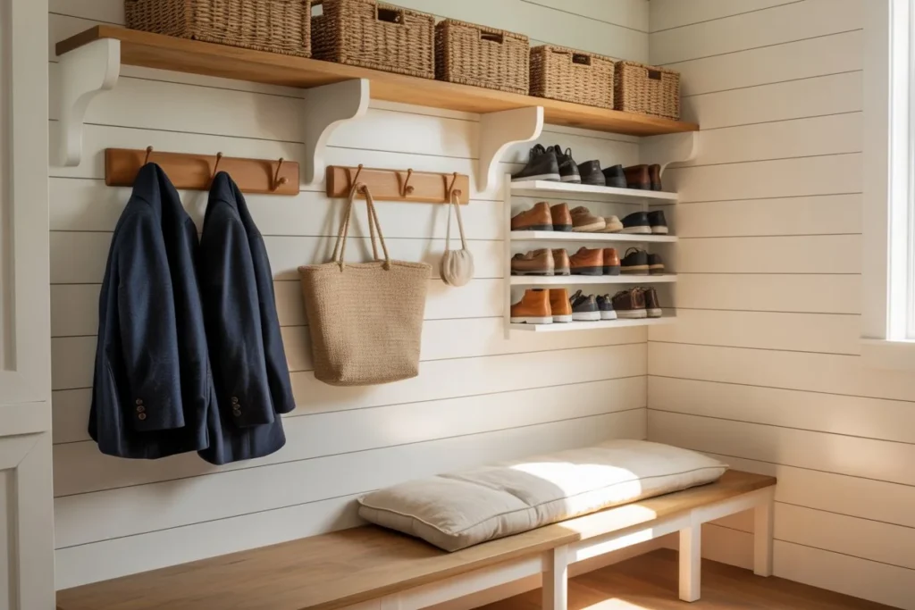
- In an entryway
- Above a desk or workspace
- On a narrow accent wall
Avoid walls already competing with large furniture, bold wallpaper, or heavy shelving. The gallery wall should enhance the space, not fight for attention.
Stick to a Limited Color Palette
One of the fastest ways a gallery wall feels crowded is too many colors competing at once.
In small spaces, cohesion is your best friend. Choose artwork that shares a common color story. This does not mean everything must match perfectly, but there should be a clear connection.
Neutral tones, soft pastels, muted earth colors, or classic black and white palettes all work especially well in tight rooms. They create visual harmony and keep the wall from overpowering the space.
Use Fewer Frames Than You Think You Need
More is not always better. In small rooms, a curated selection of pieces often looks more polished than a dense collage.
Instead of filling the entire wall, try:
- Three to five medium-sized frames
- A mix of two large pieces with one or two smaller accents
- A tight cluster rather than a wall-spanning layout
Negative space is not wasted space. It gives the eye room to rest and allows each piece to stand out.
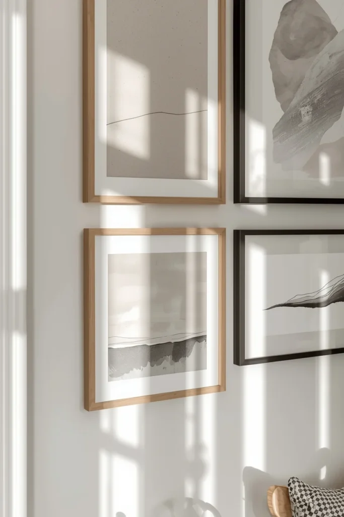
Keep Frame Styles Consistent
Mixing frame styles can be beautiful, but in small spaces, too much variation can feel messy.
To keep things clean:
- Stick to one frame color such as black, white, wood, or brass
- Use similar frame widths throughout
- Avoid overly ornate frames unless the room is very minimal
Uniform frames instantly create structure, even if the artwork itself varies in style or subject.
Play With Vertical Layouts
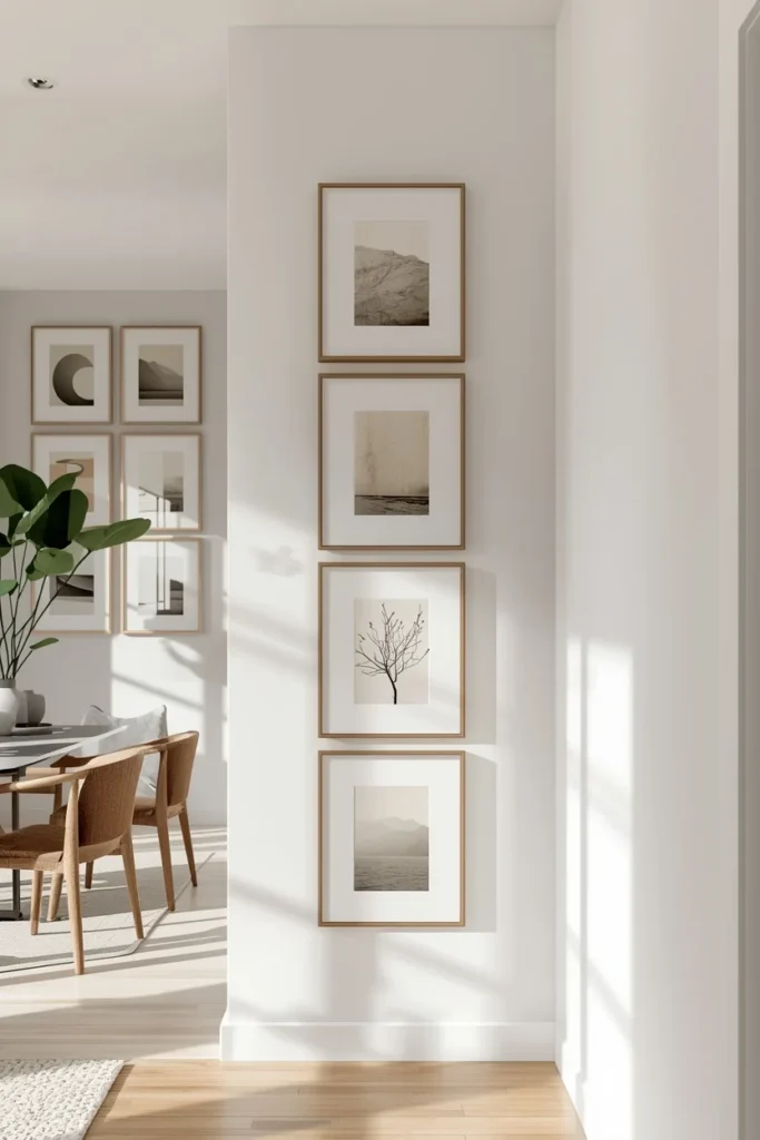
When floor space is limited, think vertically.
A vertical gallery wall draws attention upward, making ceilings appear taller. This works especially well in narrow rooms or small apartments with standard ceiling heights.
Ideas include:
- Stacking frames in a straight column
- Creating a slim grid from floor to eye level
- Hanging art in a stair-step pattern along stairs
Vertical layouts feel intentional and organized, which helps prevent visual clutter.
Mix Art With Breathing Space
Not every inch of wall needs to be filled. In fact, leaving intentional gaps between frames can make the entire arrangement feel lighter.
Spacing is crucial in small-space gallery walls. Tight spacing can feel heavy, while thoughtful gaps create rhythm and flow.
Aim for consistent spacing between frames, usually around two to three inches. This creates structure without crowding.
Incorporate Light Visual Elements
Heavy visuals can overpower a small room. Balance darker or bold pieces with lighter artwork.
Good options include:
- Line drawings
- Minimalist prints
- Soft abstract art
- Photography with light backgrounds
- Neutral typography prints
These elements reflect light and keep the wall from feeling dense or closed in.
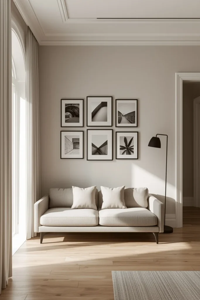
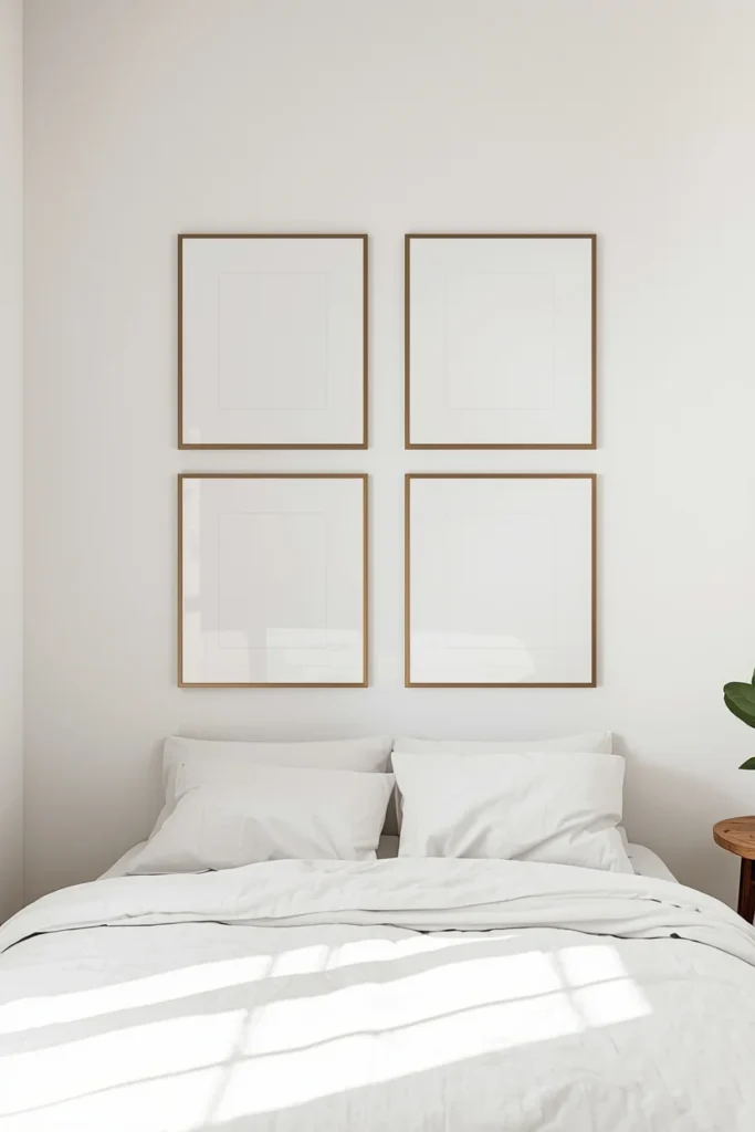
Try a Grid Layout for Clean Structure
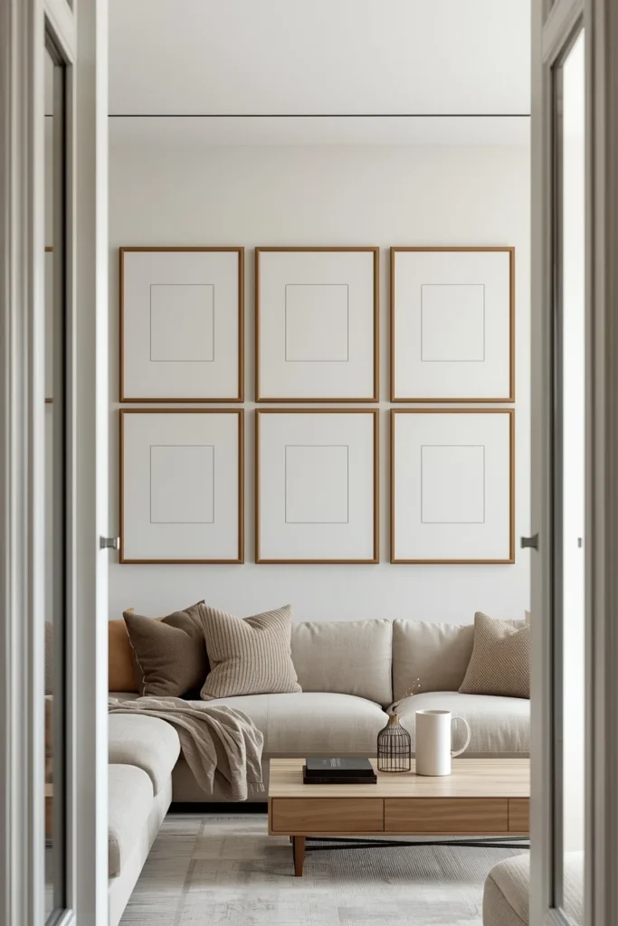
If you love order and simplicity, a grid layout is one of the best choices for small spaces.
A grid creates symmetry and predictability, which instantly calms the eye. This works particularly well in modern, minimalist, or Scandinavian interiors.
Use frames of the same size and hang them in straight rows and columns. Even a small grid of four or six frames can make a strong design statement without overwhelming the room.
Lean Art Instead of Hanging Everything
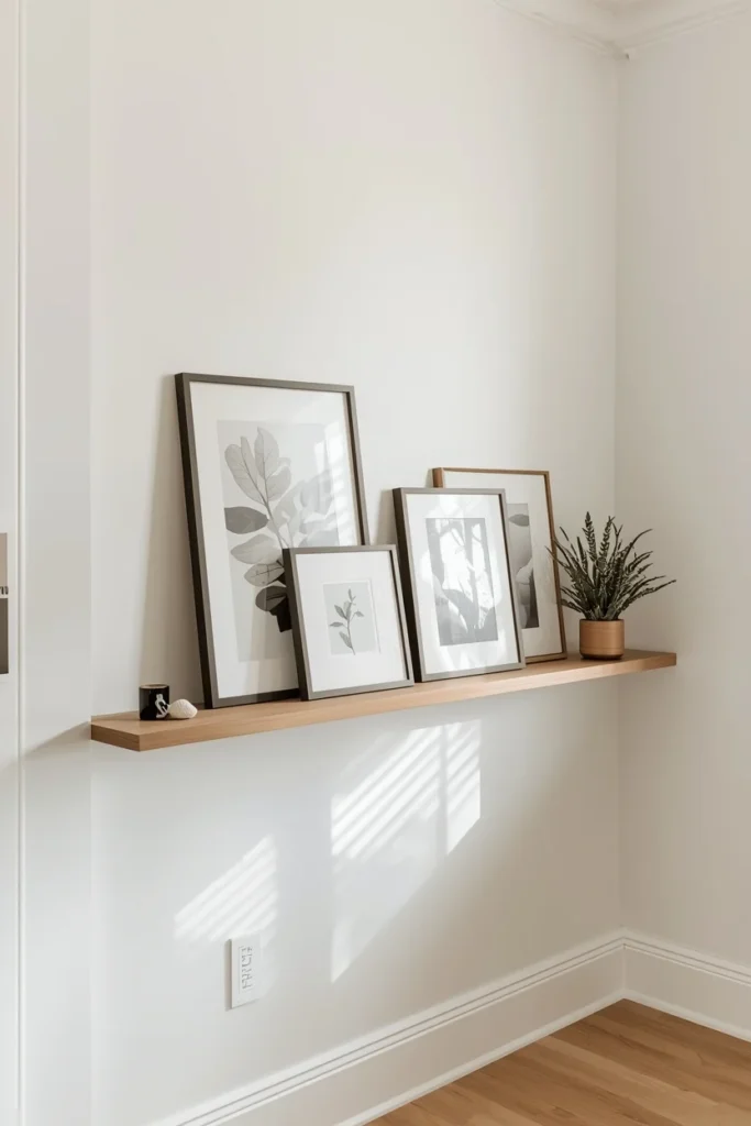
Gallery walls do not always need to be fully mounted.
Leaning frames on:
- Floating shelves
- Picture ledges
- Mantels
- Desks or consoles
This approach adds flexibility and softness to the design. It also allows you to change pieces easily without committing to permanent placement, which is perfect for renters or evolving spaces.
Mix Personal and Decorative Pieces Thoughtfully
Personal photos add warmth, but too many can feel busy in a small space.
Balance personal images with decorative art. For example:
- Pair family photos with abstract prints
- Mix travel photography with neutral artwork
- Combine personal moments with calming textures
This keeps the gallery wall from feeling emotionally heavy while still making it meaningful.
Use Mirrors to Open Up the Space
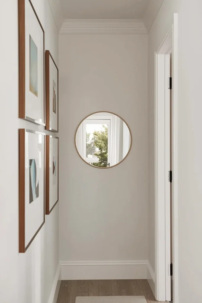
Mirrors are a powerful tool in small rooms. Incorporating one or two into a gallery wall reflects light and visually expands the space.
Choose mirrors with simple frames that match your other pieces. Avoid oversized mirrors in dense arrangements, as they can dominate the wall.
Even a small round or arched mirror can make a big difference in how open the room feels.
Match the Gallery Wall to the Room’s Function
The room’s purpose should guide your gallery wall choices.
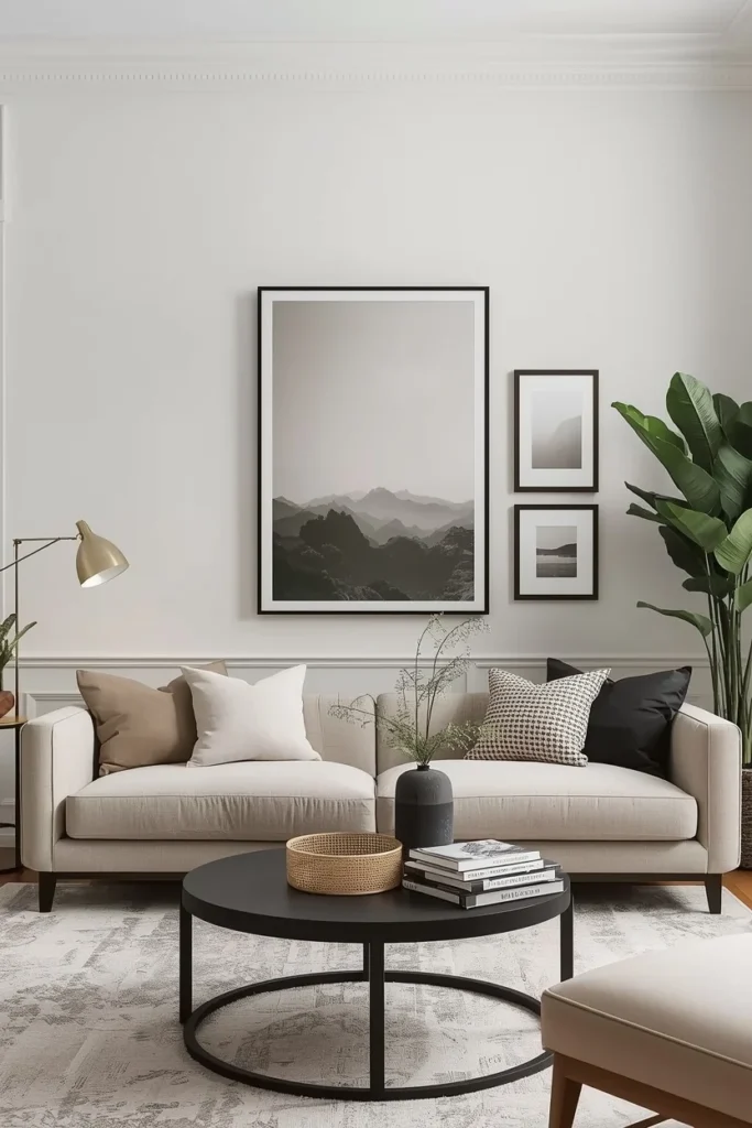
Living rooms
Opt for balanced, calming artwork that complements seating areas.
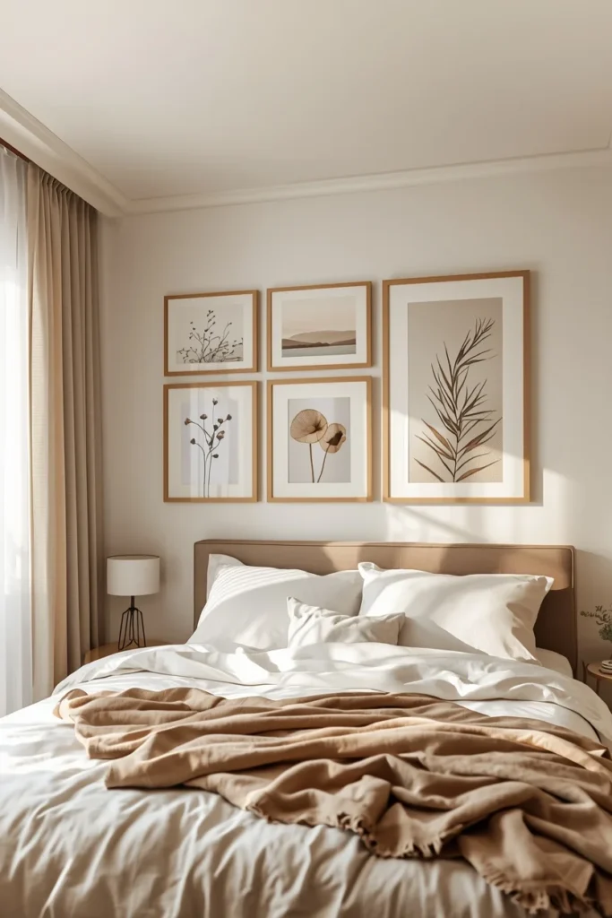
Bedrooms
Choose softer visuals and a more relaxed layout to maintain a peaceful atmosphere.
Hallways
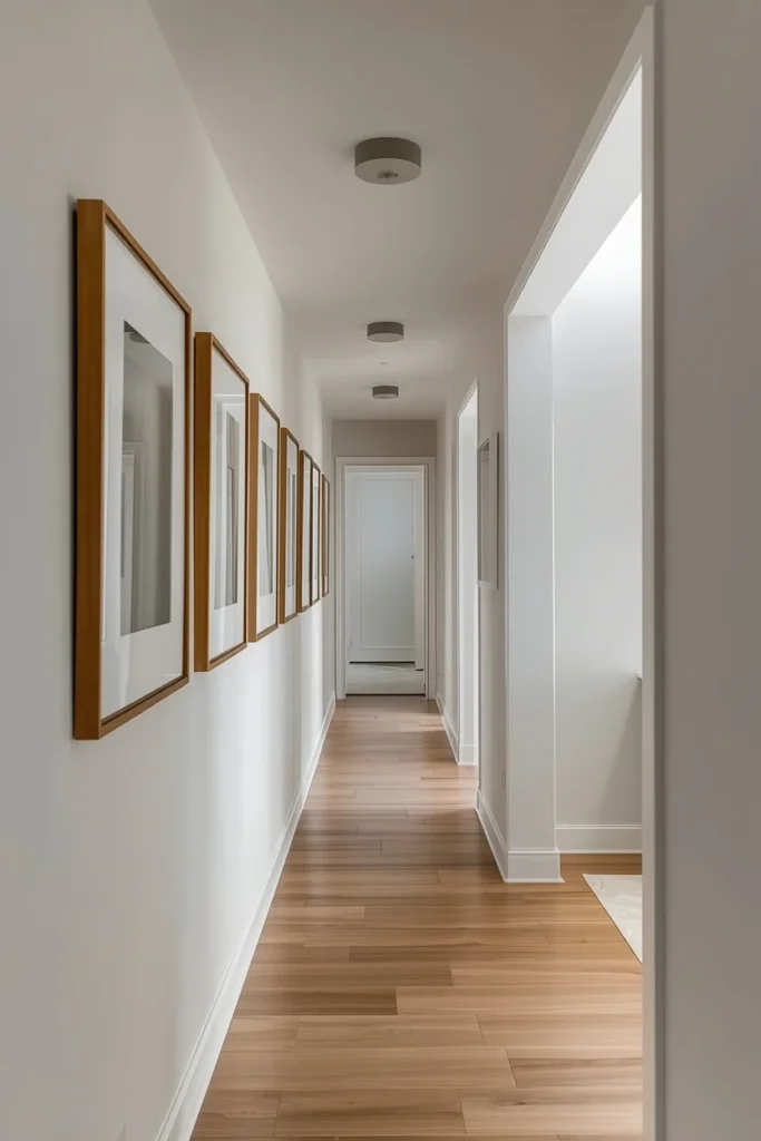
Go slightly bolder. Narrow spaces can handle stronger visual interest since they are transitional.
Home offices
Incorporate inspiring prints, quotes, or minimal artwork that supports focus without distraction.
When the gallery wall aligns with how the room is used, it feels natural rather than forced.
Scale Artwork to the Wall, Not the Room
One common mistake is choosing art that is too small for the wall, which leads to overcrowding as people add more pieces to compensate.
Instead, let one or two larger pieces anchor the arrangement. Larger art creates impact without needing multiple frames.
A single oversized print paired with one or two smaller accents often looks cleaner than many tiny frames clustered together.
Keep the Surrounding Decor Simple
A gallery wall does not exist in isolation. The furniture and decor around it matter.
If the wall is visually active:
- Choose simple furniture lines
- Avoid busy textiles nearby
- Keep surfaces like tables or shelves uncluttered
This contrast allows the gallery wall to shine without overwhelming the space.
Refresh Without Rebuilding
Small-space gallery walls benefit from occasional updates.
Instead of redoing everything:
- Swap out one or two prints seasonally
- Change mat colors for a fresh look
- Rearrange pieces slightly to renew interest
This keeps the wall feeling dynamic without adding visual clutter.
Common Mistakes to Avoid
Even well-intentioned gallery walls can miss the mark in small spaces. Watch out for these pitfalls:
- Hanging too many frames too close together
- Mixing too many colors or frame styles
- Ignoring alignment and spacing
- Choosing art that is too small
- Competing with bold wallpaper or furniture
Avoiding these mistakes makes the difference between a crowded wall and a curated one.
Final Thoughts
A gallery wall in a small space is not about fitting in as much as possible. It is about editing, intention, and balance.
When you focus on cohesive colors, thoughtful spacing, and purposeful layouts, a gallery wall can enhance even the smallest room. It adds personality without clutter and visual interest without chaos.
With the right approach, your small-space gallery wall will feel open, stylish, and deeply personal, proving that limited square footage does not limit great design.