Choosing the right paint color is one of the most important decisions in home decor. Wall color does more than fill space. It sets the mood, highlights furniture, and brings the entire room together.
When paint colors clash with furniture, even expensive decor can look unbalanced. When they work together, the space feels intentional, calm, and visually appealing.
This guide will walk you through how to pick paint colors that match your furniture decor, using proven interior design principles, color theory basics, and practical tips you can apply to any room.
Whether you are decorating a living room, bedroom, or dining space, these ideas will help you make confident color choices.
Why Matching Paint Color With Furniture Matters
Furniture usually stays in place longer than paint. Sofas, beds, dining tables, and cabinets are investments. Paint, on the other hand, is easier to change. That is why most interior designers recommend choosing wall colors that complement existing furniture rather than the other way around.
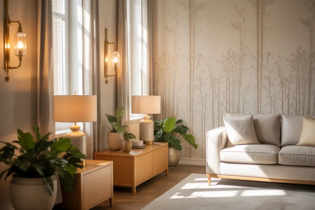
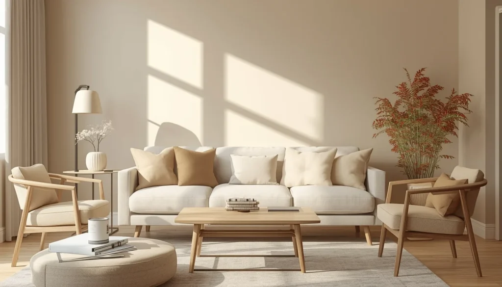
When paint colors match furniture decor, rooms feel visually calm and well planned. Colors repeat naturally, textures stand out, and the overall space feels cohesive. Poor color choices can make furniture look dull, outdated, or disconnected from the room.
Start by Identifying Your Furniture Color Palette
Before looking at paint swatches, it is important to understand the colors already present in the furniture.
Look at the Dominant Furniture Color
Most rooms have one main furniture piece that sets the tone. This could be a sofa in the living room, a bed frame in the bedroom, or kitchen cabinets. Identify the dominant color first.
Common furniture colors include:
- Brown and beige wood tones
- Gray or charcoal upholstery
- White or cream furniture
- Black or dark espresso finishes
- Bold colors like navy, green, or rust
This main color will guide the paint selection.
Notice Secondary and Accent Colors
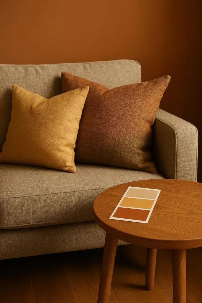
Furniture often includes more than one color. Cushions, chairs, rugs, and side tables all add layers. These secondary colors can inspire accent walls or help narrow down paint options.
For example, a neutral sofa with blue cushions opens the door for soft blue gray walls or warm off white paint.
Understand Warm and Cool Undertones
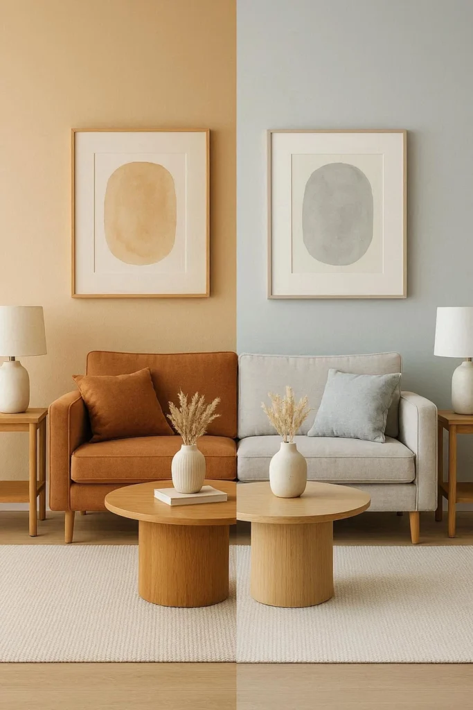
One of the most common mistakes in choosing paint colors is ignoring undertones. Two colors can look similar but clash because their undertones do not match.
Warm Undertones
Warm colors have hints of yellow, red, or orange. Many wooden furniture pieces fall into this category.
Warm furniture pairs well with:
- Creamy whites
- Beige and greige
- Warm taupe
- Soft terracotta or muted clay tones
Cool Undertones
Cool colors include blue, green, or violet undertones. Gray furniture often falls into this group.
Cool furniture works best with:
- Crisp white paint
- Cool gray walls
- Soft blue or sage green
- Muted lavender or blue gray
Matching undertones keeps the room from feeling visually uncomfortable.
Use the Color Wheel as a Simple Guide
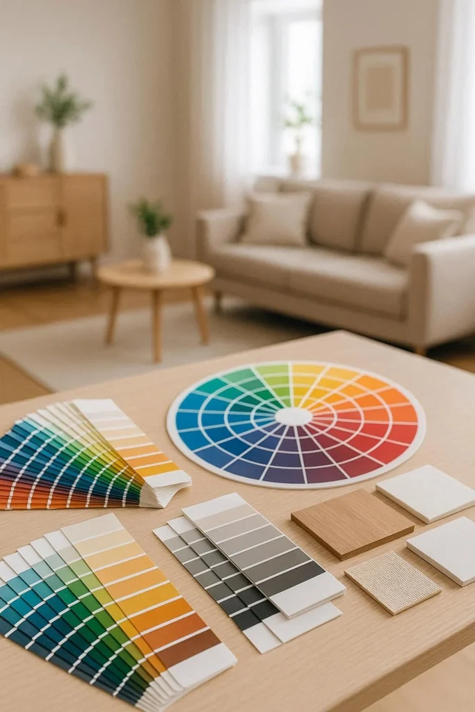
The color wheel is a helpful tool when selecting paint colors that work with furniture decor.
Neutral Furniture Offers Flexibility
Neutral furniture like gray, beige, white, or black works with many wall colors. This allows for more freedom with paint choices.
For example:
- Gray furniture pairs with white, blue gray, blush, or even soft yellow
- Beige furniture looks great with warm white, olive green, or muted blue
Complementary Color Choices
Complementary colors sit opposite each other on the color wheel. Used carefully, they add contrast without overwhelming the space.
A navy sofa can look striking against soft warm beige walls. A deep green chair can stand out beautifully against muted blush paint.
Analogous Color Schemes
Analogous colors sit next to each other on the color wheel and create a calm, cohesive look.
For instance, blue furniture with blue green or blue gray walls feels smooth and well coordinated.
Consider Furniture Material and Finish
Color is not the only factor. Material and finish matter just as much.
Wood Furniture and Paint Colors
Wood furniture varies widely in tone. Light oak, medium walnut, and dark mahogany all interact differently with wall colors.
- Light wood pairs well with white, pastel, and soft neutral paint
- Medium wood works with warm neutrals, muted greens, and soft grays
- Dark wood looks best against lighter walls to prevent the room from feeling heavy
Upholstered Furniture
Fabric texture affects how color is perceived. Velvet absorbs light and feels rich, while linen feels airy and casual.
Soft fabrics pair nicely with gentle paint colors, while leather furniture often looks best against warm neutrals or deep accent walls.
Pay Attention to Natural and Artificial Lighting
Lighting changes how paint looks throughout the day. A color that looks perfect in a store may feel completely different at home.
Rooms With Natural Light
Bright rooms can handle deeper or cooler colors. Sunlight balances darker shades and prevents them from feeling too heavy.
In sun filled spaces:
- Dark blue or green walls can work well
- Cool gray paint looks cleaner
- Bold accent walls feel less overwhelming
Rooms With Limited Light
Rooms with little natural light benefit from lighter, warmer colors.
In darker rooms:
- Warm white paint brightens the space
- Light beige or soft greige adds warmth
- Avoid very dark or cold tones that absorb light
Always test paint samples on walls near furniture and observe them at different times of day.
Decide Between Neutral Walls or Statement Walls
Not every room needs bold color. The choice depends on furniture style and personal taste.
Neutral Walls for Timeless Decor
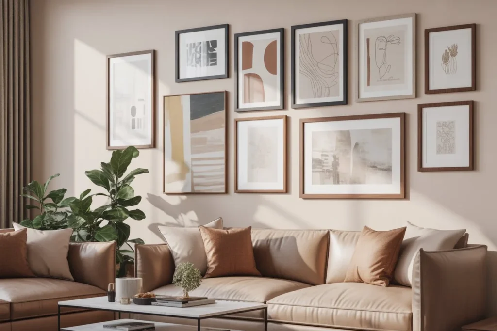
Neutral wall colors are a safe choice, especially when furniture is bold or patterned. They allow furniture decor to stand out.
Popular neutral paint options include:
- Warm white
- Soft beige
- Light gray
- Cream
These shades work well for Pinterest friendly interiors and long term appeal.
Accent Walls for Visual Interest
An accent wall can highlight furniture and add personality without overwhelming the space.
A dark accent wall behind a bed or sofa can make the furniture look more intentional. Choose a color already present in cushions, artwork, or rugs for a cohesive look.
Match Paint Color With Furniture Style
Furniture style plays a big role in choosing the right paint color.
Modern and Contemporary Furniture
Clean lines and minimal designs pair well with:
- White or off white walls
- Cool gray paint
- Muted monochromatic color schemes
Traditional Furniture
Classic furniture with ornate details looks best with:
- Warm neutral walls
- Soft taupe or beige
- Muted blues and greens
Rustic or Farmhouse Decor
Rustic furniture feels cozy with:
- Warm white paint
- Soft sage green
- Greige or light tan
Bohemian or Eclectic Decor
Eclectic spaces allow more color freedom. Earth tones, warm neutrals, and layered colors work well with mixed furniture styles.
Test Before Committing
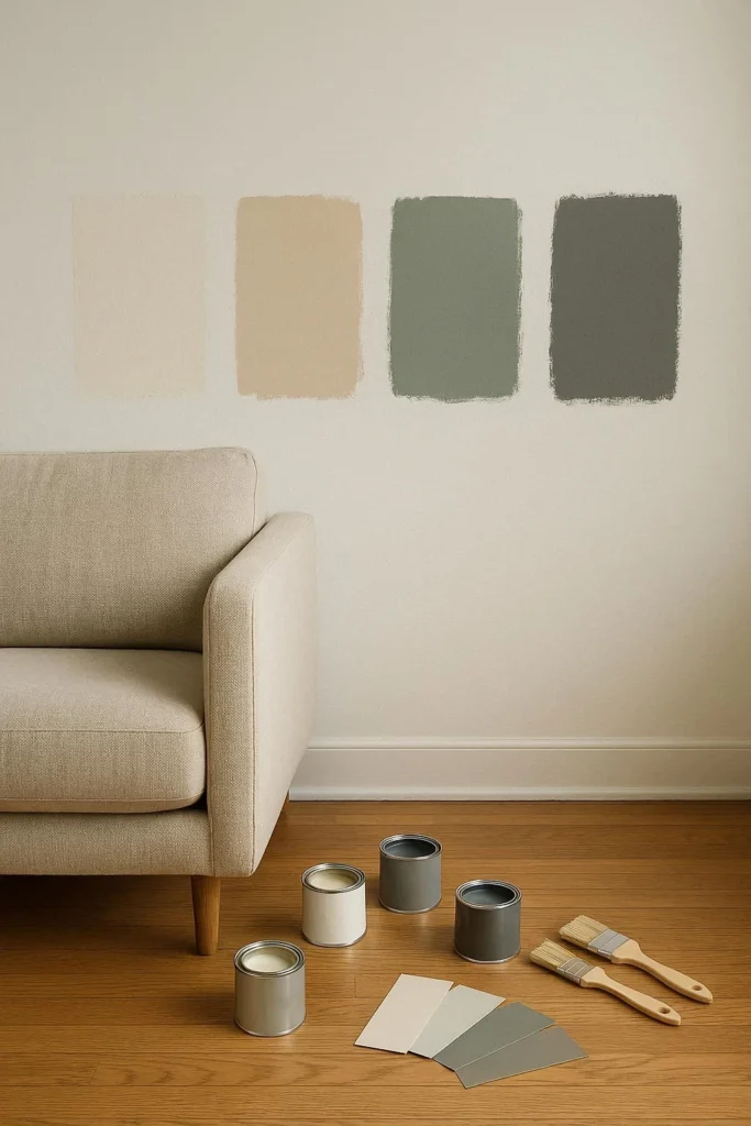
Paint always looks different on walls than on swatches.
Use Sample Paint on Large Areas
Apply sample paint next to furniture and observe it for a few days. Look at it in daylight and at night.
This step helps avoid costly mistakes and ensures the paint truly matches the furniture decor.
Common Mistakes to Avoid
Even with good planning, mistakes can happen. These are some of the most common ones.
- Choosing paint first instead of considering furniture
- Ignoring undertones in furniture and paint
- Using too many colors in one room
- Picking trendy colors that do not suit existing decor
- Forgetting how lighting affects color
Avoiding these issues leads to a more polished and comfortable home.
Final Thoughts on Choosing the Right Paint Color
Picking paint colors that match furniture decor does not require professional training. It requires observation, patience, and understanding how color works in a space.
By starting with furniture, paying attention to undertones, considering lighting, and testing samples, anyone can create a room that feels balanced and welcoming. The right paint color enhances furniture, highlights decor, and brings the entire room together.
A well chosen color palette not only improves how a home looks but also how it feels. When walls and furniture work in harmony, the space becomes easier to enjoy and easier to style over time.