Bold paint colors are no longer reserved for accent walls or daring designers. Homeowners everywhere are embracing deep, rich shades to give their rooms character, warmth, and a sense of personality. From dramatic living rooms to cozy bedrooms and energetic kitchens, the right bold paint choice can change how a space feels the moment someone walks in.
This guide explores bold paint color ideas in detail, along with tips on choosing the right shades, pairing them with furniture, and making sure the final look feels intentional rather than overwhelming.
Why Bold Paint Colors Are Back in Style
Neutral interiors had a long run, but today people want their homes to reflect who they are. Bold wall colors bring life into rooms that feel flat or predictable. They add depth, create mood, and often make a space feel more finished.
Designers are also using bold colors to solve common problems such as low light rooms, awkward layouts, or bland builder grade walls. With thoughtful planning, bold paint can make small spaces look larger and dark rooms feel richer.
Understanding What Makes a Paint Color “Bold”
Bold does not always mean bright. It often refers to colors with strong pigment, deeper saturation, or unexpected undertones. Think jewel tones, earthy clay shades, moody blues, or warm spiced neutrals.
Some examples include:
- Emerald green
- Navy blue
- Charcoal gray
- Terracotta
- Mustard yellow
- Plum purple
- Teal
- Burgundy
- Forest green
- Burnt orange
These shades stand out without shouting, and they work across many home decor styles.
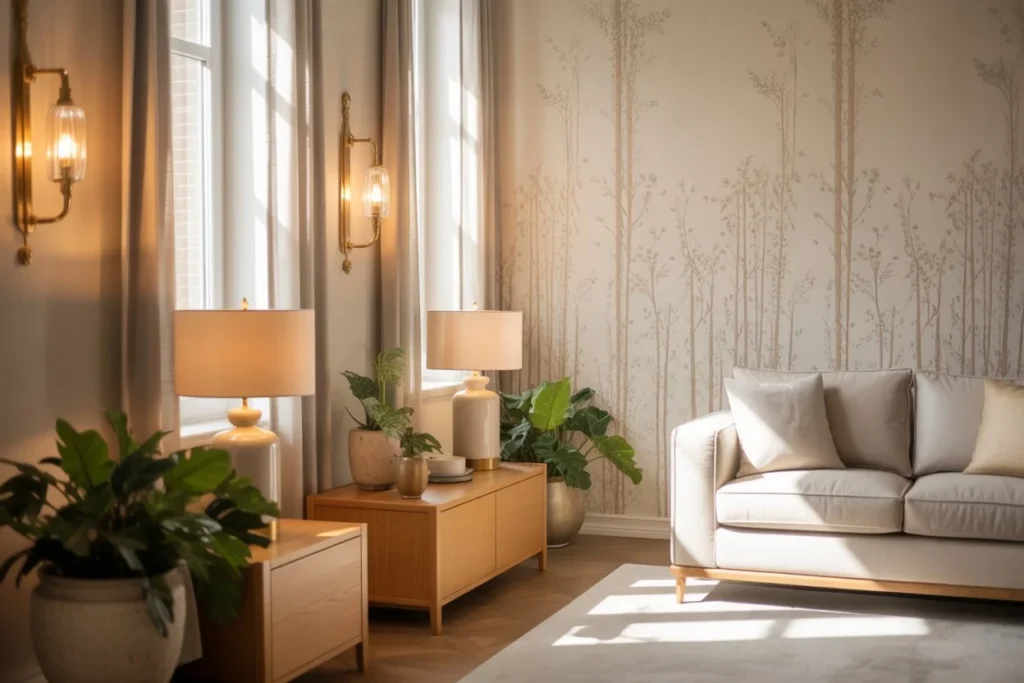
Bold Living Room Paint Color Ideas

The living room is usually the heart of the home, which makes it a great place to experiment with bold wall colors.
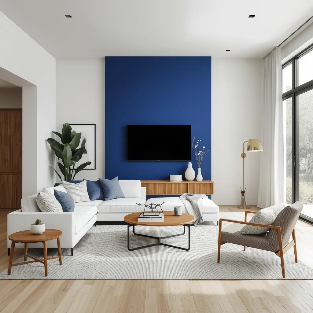
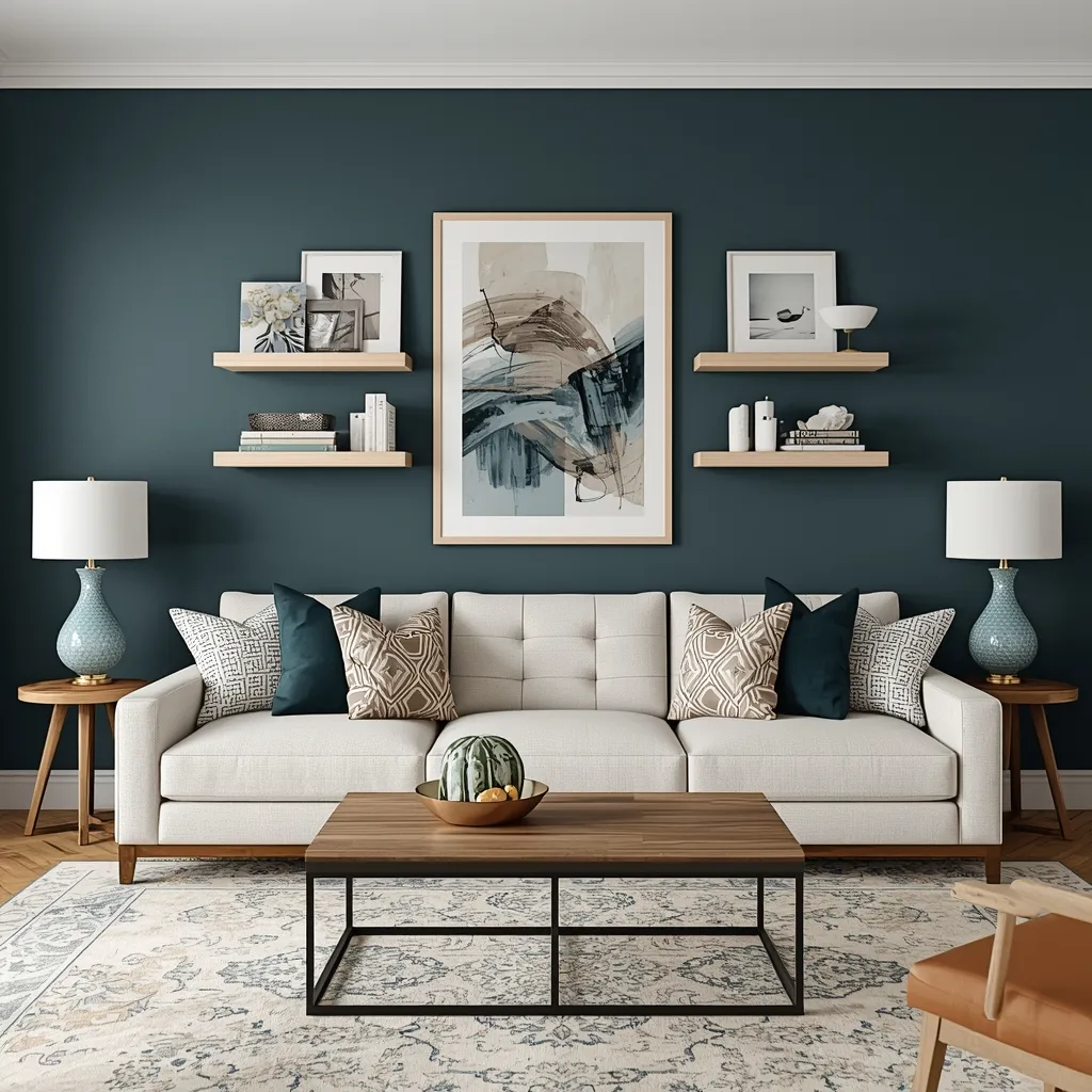
Deep Blue for Calm and Confidence
Navy and midnight blue add sophistication to living spaces. They work beautifully with light wood furniture, brass accents, and white trim. In rooms with plenty of natural light, blue walls feel calm rather than heavy.
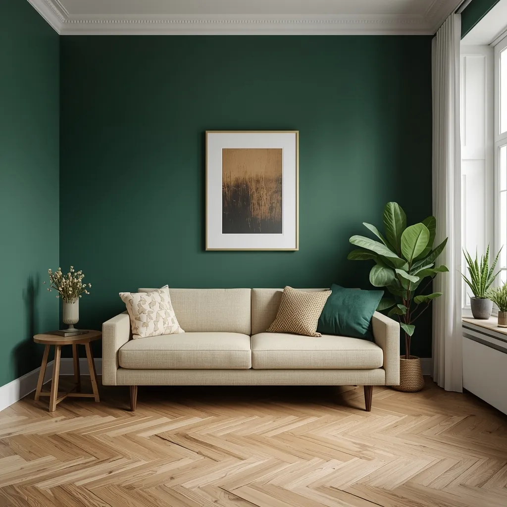
Emerald Green for Luxury
Emerald green walls bring a rich, upscale feel to living rooms. This shade pairs well with velvet sofas, marble coffee tables, and gold decor. It also complements indoor plants, making the space feel balanced.
Charcoal Gray for Modern Homes
Charcoal gray is perfect for people who want bold without going too colorful. It creates contrast with white ceilings and light floors while still feeling grounded and neutral.
Bold Bedroom Paint Color Ideas for Cozy Retreats
Bedrooms should feel personal and restful, even when painted in bold shades.
Moody Plum and Eggplant
Deep purple tones create a cocoon like atmosphere that is ideal for bedrooms. When paired with soft bedding and warm lighting, plum walls feel luxurious rather than dark.
Forest Green for Nature Lovers
Forest green walls bring the outdoors inside. This shade works well in both modern and rustic bedrooms, especially when combined with linen textures and natural wood furniture.
Burnt Orange for Warmth
Burnt orange and spiced terracotta tones are perfect for bedrooms that feel cold or bland. These colors add warmth and work beautifully with cream or beige bedding.
Bold Kitchen Paint Color Ideas That Energize
Kitchens are becoming more expressive, and bold paint is leading the way.
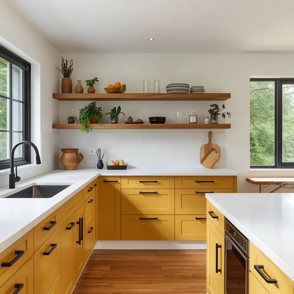
Mustard Yellow Cabinets or Walls
Mustard yellow adds energy without feeling childish. It looks great with white countertops, black hardware, and open shelving.
Teal for a Fresh Look
Teal kitchen walls or cabinets strike a balance between blue and green, making the space feel fresh and modern. It pairs well with light wood floors and subway tile backsplashes.
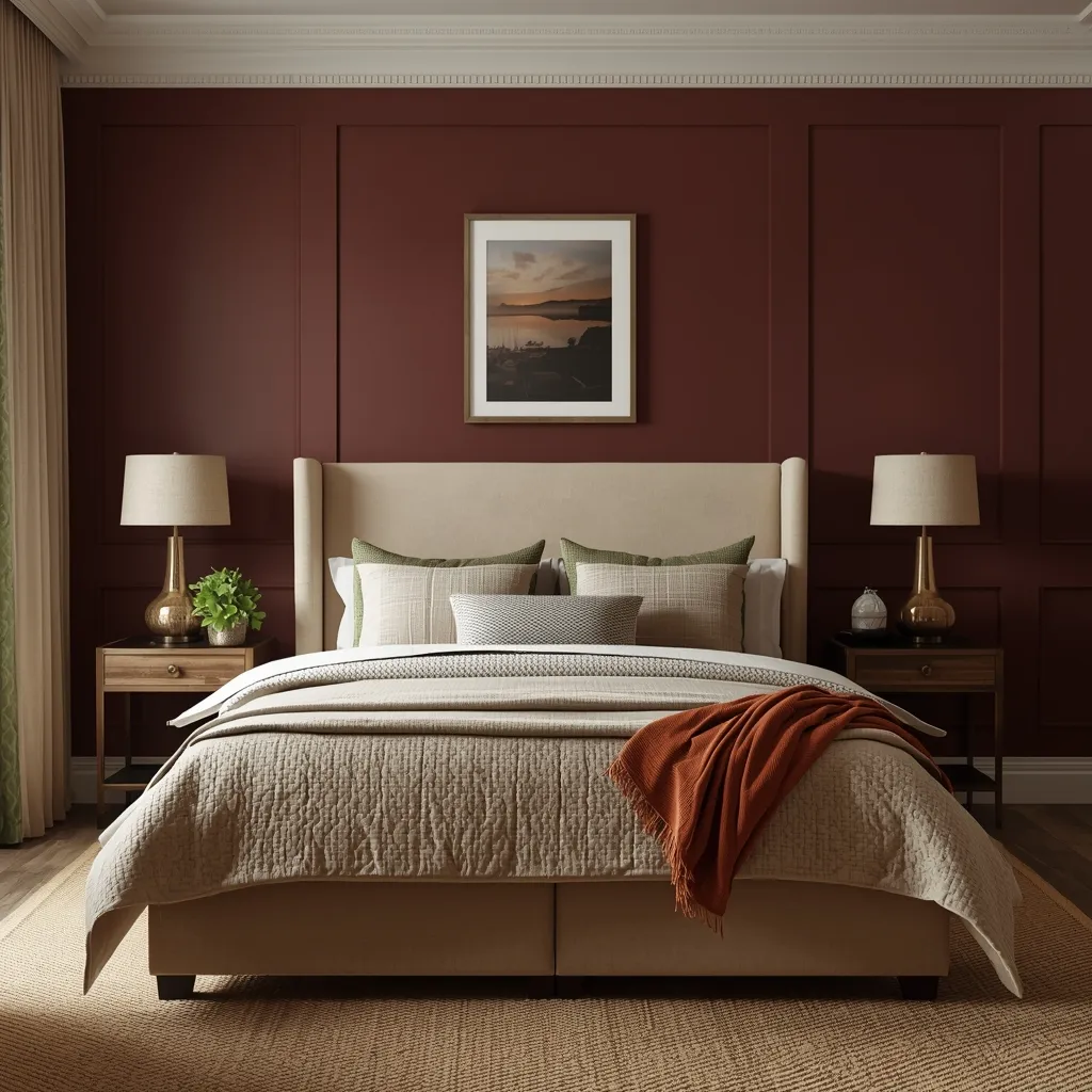
Dark Red and Burgundy
Burgundy or wine colored kitchens feel cozy and elegant. These shades work especially well in homes with traditional or farmhouse inspired decor.
Bold Paint Color Ideas for Low Light Rooms

Rooms with limited natural light often benefit from deeper shades.
Inky Blue and Soft Black
In spaces that do not get much sunlight, dark walls can actually look better than pale ones. Inky blue or soft black adds drama and depth, turning a dull room into a statement.
Chocolate Brown and Warm Taupe
Warm browns create a grounded feel in basements, hallways, or small offices. These colors prevent the space from feeling flat or cold.
How to Pick Bold Paint Colors That Match Furniture
Choosing bold paint colors should start with what is already in the room.
- Rooms with light furniture handle dark walls well.
- Spaces with dark wood look best with jewel tones or warm neutrals.
- Gray sofas pair nicely with navy, teal, or charcoal.
- Tan or beige furniture looks great against emerald, terracotta, or deep blue.
The goal is contrast without clash. A simple trick is to hold fabric samples against paint swatches before committing.
Bold Accent Walls vs Full Room Color

Not every room needs all four walls painted in bold shades.
Accent Walls
Accent walls work well behind beds, sofas, or fireplaces. They draw attention to focal points without overpowering the room.
Full Room Color
Painting all walls in one bold shade creates a more immersive feel. This works best in smaller rooms like powder rooms, reading nooks, or offices.
Best Bold Paint Colors for Small Spaces
Small spaces often feel forgotten, but they are ideal for bold paint.
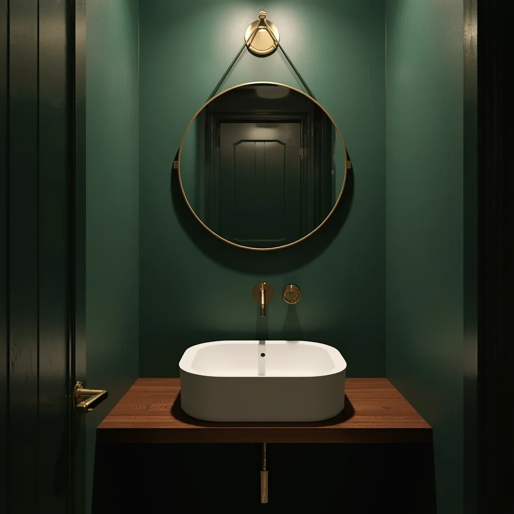
Powder Rooms
A tiny powder room with deep navy or emerald walls feels like a jewel box. Add patterned wallpaper or gold framed mirrors to elevate the look.
Hallways and Entryways
Bold wall colors in entryways make a strong first impression. Colors like teal, charcoal, or burnt orange set the tone for the rest of the home.
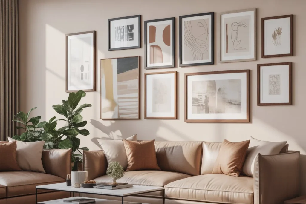
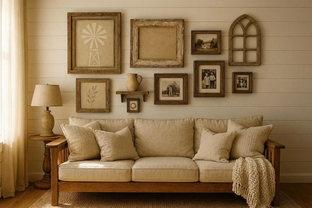
Pairing Bold Paint Colors with Wall Decor
Wall decor matters even more when the background is bold.
- Light colored frames pop against dark walls.
- Black frames look striking on mustard or terracotta.
- Metallic wall art stands out on navy and forest green.
- Floating shelves soften bold walls and provide balance.
Avoid overcrowding bold walls. Let each piece breathe so the color remains the star.
Trending Bold Paint Color Palettes
Earthy and Grounded
- Terracotta
- Olive green
- Warm taupe
- Clay beige
Jewel Inspired
- Emerald green
- Sapphire blue
- Amethyst purple
- Ruby red
Modern Dark Neutrals
- Charcoal gray
- Soft black
- Slate blue
- Deep greige
These palettes work across many interior styles, from minimalist to farmhouse.
Common Mistakes to Avoid with Bold Paint Colors
Even the best colors can go wrong if applied carelessly.
- Skipping test samples. Paint looks different on walls than on cards.
- Ignoring lighting. What looks bold in the store may look dull at home.
- Forgetting undertones. Two blues can clash because of hidden green or purple tones.
- Overloading decor. Bold walls need thoughtful styling, not clutter.
How Bold Paint Impacts Mood
Color psychology plays a major role in interior design.
- Blue shades promote calm and focus.
- Green brings balance and relaxation.
- Red and orange energize and warm the room.
- Purple adds creativity and luxury.
- Yellow lifts mood and makes spaces feel cheerful.
Knowing the emotional effect of each shade helps homeowners choose colors that suit their lifestyle.
Bold Paint Finishes That Elevate the Look
The finish matters just as much as the color.
- Matte finishes soften bold colors and hide imperfections.
- Satin works well in living rooms and bedrooms.
- Semi gloss highlights bold shades on trim or doors.
- High gloss adds drama to feature walls or cabinets.
Making Bold Colors Work in Open Floor Plans
Open layouts can still handle bold paint if the colors flow together.
Stick to a consistent undertone family and vary the depth. For example, pair deep navy in the living room with muted blue gray in the kitchen to create cohesion without boredom.
Final Thoughts
Bold paint colors are about confidence, not chaos. When chosen thoughtfully, they bring warmth, depth, and personality into any room. From emerald living rooms to terracotta bedrooms and mustard kitchens, there is a bold shade for every style and mood.
With the right balance of lighting, furniture, and wall decor, bold paint becomes more than just color. It becomes the soul of the space.